Basic Tutorials
3 Basic tutorials covering the core functionality of Anaqsim. All can be run using the Demo version of Anaqsim
Tutorial 1
Building a single-layer heterogeneous, anisotropic model with various boundary conditions
Introduction
This first tutorial will introduce you to Anaqsim’s user interface and walk you through building a single-layer steady flow model with a variety of boundary conditions. All tutorial models may be built with the unlicensed version of Anaqsim.
Before starting the tutorials, you should read the User Guide (available on this documentation site, and via the 'help' menu in the user interface) in particular the section titled “User Interface”. These tutorials presume you have already read these sections of the User Guide. It is also assumed that you have installed Anaqsim.
Please see the Introduction | Anaqsim Section of the User Guide for instructions on downloading, installing and licensing.
Starting Anaqsim
Anaqsim can be started by clicking on the Windows Start button at the lower left of your screen and searching for Anaqsim.
The user interface consists of three tabs: Plot, Data and Log. You can move between them by clicking on the tab at left. The currently displayed tab is shown in blue:

The Plot tab displays various plots in the X-Y plane, the Data tab is where you enter and edit input data, and the Log tab displays text outputs from Anaqsim.
Setting up a Basemap
It's very hand to have a basemap and then digitize model elements over the basemap. Anaqsim uses DXF basemaps, a format that can typically be exported from CAD and GIS programs.
Select Plot Input / What to Plot from the main menu.
Edit the Basemap and Elements cells of data grid so that it looks like the following image.

With these settings, the basemap will be displayed gray (or you could chose to display it in its original colors) and when elements are displayed, they will show control points and have pop-up text explaining details. Click the Select button in the Basemap_File column, then find and select the basemap file, which should be located here:
C:\Program Files\Yellow Sub Hydro\Anaqsim\Documentation\basemap.dxf
By leaving the Window cell blank, plots will include the entire area covered by the model elements. If you want to make a plot of a smaller window, coordinates can be entered in this cell.
Display the Basemap
Select Make Plot / Model Elements Only and then press the OK button int he dialog that shows.
Select Zoom All in the plot view menu, and you will see the basemap with these features:
- a lake shore along the east side
- an impermeable aquifer boundary to the south, west, and north
- a polygon recharge basin area
- a well
- a stream that goes from stage 121 in the west to 106 in the east

At this point, save your input by selecting File / Save As, and then choose a file name and path that suits you.
General Input
Begin creating model input by selecting Model Input / General under the main menu. Check the Steady cell since this will be a steady-state, not transient, model. Enter the units you choose for the model and a comment to characterize the model; these are just optional text entries to help document your model. Here is a completed example:

Units in Anaqsim
In Anaqsim, all input is in a consistent set of units. For example with meter and day units, discharges would be in m3/day and hydraulic conductivities would be in m/day. Anaqsim doesn't keep track of what units you are using, so it is up to you to make sure all input is in terms of one consistent system of units based on the same length and time units.
Domain Input
Before entering other model inputs, we must first define the properties of the aquifers or regions within the model. Anaqsim uses the term domain to refer to regions within which the aquifer properties are constant. These can vary by layer in multilayer models and by location within a layer in heterogeneous models.
Select Model Input / Domains / Confined and/or Unconfined and edit the table so it has two completed rows and looks like the following.

The domain labels need to be unique because they are referenced by other kinds of model inputs such as wells and line boundaries. The 'all' domain will span all of the model, except for the small polygon area that will be the 'recharge basin' domain. These two domains are identical in their properties, but defining them separately allow sus to define different recharge rates in the two domains.
The domains are both unconfined with a base at elevation 82. With unconfined domains the top elevation is not used.
Average_head is your best estimate of the average head in the domain, and this determines a constant that is added to the solution. Your choice of Average_head will no matter so long as it is close to the middle of the range of simulated heads in the domain.
Porosity is used in computations of travel time along pathlines. The storage parameters Storativity and Specific_yield have no bearing on a steady model.
The horizontal hydraulic conductivity is anisotropic, with K1=3 and K2=0.6. The K1 direction is oriented 30 degrees counter clockwise from the positive x-axis (30 degrees N from due E). The K2 direction is normal to the K1 direction.
The values of K3 define the resistance to vertical flow in multi-level models or in sing-level models with head-dependent leakage. Since this model has neither, the values of K3 are not used.
Now you have defined the properties of the two domains. The location and extent of these domains are defined by the external line boundaries, which we will enter in the next sections.
Save your model again using File / Save or by typing the keyboard shortcut Ctrl-S.
Adding the Lake Boundary
Next we will add a constant head boundary at the lake shore using the digitizing features in Anaqsim.
Select Model Input / Line Boundaries / Head-Specified to bring up that data table. Edit the table so it looks like this:

This line boundary is an external boundary to the 'all' domain, hence the Domain_Boundary cell is checked. If this boundary was internal to the domain, this would not be checked. The specified head is set to 104 along this entire boundary.
The Parameters_per_line entry defines how many degrees of freedom each segment of the boundary will have and at the number of points on each segment where the specified head condition will be met perfectly. Larger numbers here will make for more accurate boundary conditions at the cost of more equations and longer solve computation time. In transient models, you can turn the boundary conditions off during the Off_periods you enter, but that has no bearing on this steady model.
Digitizing a line boundary
Next, you will digitize the coordinates of the line boundary. Click on the Plot tab to display the plot and basemap. Before starting, please watch this video about digitizing and snap settings.
Ditigize the lakeshore boundary either from N to S or S to N (for head-specified boundaries, direction doesn't matter). After digitizing, your digitized line (yellow) should look something like this:

Click on the Data tab to display the data table for head-specified line boundaries.
Click on the Edit button in the Coordinates column to show the coordinates window and paste (Ctrl-V) the digitized coordinates in, resulting in something like this:

Press OK to save and close this window.
Save your model again using File / Save or by typing the keyboard shortcut Ctrl-S
Adding the Impermeable Aquifer Boundary
Now we will add the impermeable aquifer boundary that forms the S, W, and N boundaries of the aquifer. Select Model Input / Normal Flux-Specified to open the data table for this kind of boundary. Edit the table so it looks like this:

This boundary is also external to the domain. It will be impermeable because the normal flux is set to zero along it. It is also possible to specify a non-zero flux in/out of the domain boundary.
The 3 parameters per line means there are three degrees of freedom per line segment, and the normal flux will be perfectly set to zero across three different sub-segments of each line segment.
Click on the Plot tab. Make sure the Snap Settings are checked for Snap to Elements and Snap to Digitized Data. This will assure that your digitized boundaries match perfectly at common vertexes.
Digitize the 'Aquifer Boundary' shown in the basemap, from the north end of the lake shore boundary (NW of the northernmost 'Lake' on the basemap), going counter clockwise around the N, W, then S parts of this boundary until it ends at the south end of the lake shore boundary (SW of the southernmost 'Lake' on the basemap). Digitizing this type of boundary must be done counter clockwise, since the boundary conditions are imposed on the left side of the boundary as you proceed from the first towards the last vertex. See the User Guide for more information on this type of boundary. After digitizing, the plot will look something like this:

Click on the Data tab to display the data table for normal flux-specified line boundaries.
Click on the Edit button in the Coordinates column of the row for this boundary to show the coordinates window and then paste (Ctrl-V) the digitized coordinates in, then press OK to save and close this window. Save your model again using the File / Save or by typing the keyboard shortcut Ctrl-S.
Plotting the Elements and Examining the Details
Make a plot of the model elements that have been input so far by selecting Make Plot / Model Elements Only, then selecting Level 1 and pressing OK. The resulting plot will look as follows, with the entered line elements shown green.

If you move the cursor over a line boundary, it turns black and a pop-up text window defines the boundary. If you hover over the small circles at vertexes, it displays the boundary condition specifics at that vertex.
Graphically Editing a Line Boundary
Please see this video on how to graphically edit well and line boundary coordinates.
Select the outer impermeable 'outer' aquifer boundary and experiment with moving, adding, and deleting vertexes in the line boundary, then select Make Plot / Model Elements Only to see the altered line boundary.
Adding River and Line Boundaries
We will add three river line boundaries to represent three reaches of the stream shown in the basemap. We will start with the lowest reach.
Select Model Input / Line Boundaries / River, and edit the table so it looks like this:

River boundaries are always internal to a domain. By not checking the Dries_up, this river reach will maintain its stage and leak to/from the domain, even if the domain heads drop below stage. The starting and ending stages correspond to the vertexes labeled 'h=106' and 'h=108' on the basemap. See the User Guide for more information on this type of boundary.
Click on the Plot tab.
Right-click anywhere on the plot area and select Digitize / Polyline from the right-click menu. Digitize the lower (east) river reach, starting at the east end where it meets the lake boundary, and ending at the vertex labeled 'h=108'.
Click on the Data tab to display the data table for river line boundaries.
Click on the Edit button in the Coordinates column to show the coordinates window and then paste (Ctrl-V) the digitized coordinates in, then press OK to save and close this window.
Select Make Plot / Model Elements Only to make a plot that should look like this:

Repeat these steps to create the input for the middle ('h=108' to 'h=114') and upper ('h=114' to 'h=121') reaches of the stream, digitizing and entering the coordinates as you did with the lower reach:

Save your model again using the File / Save or by typing the keyboard shortcut Ctrl-S.
Adding the Interdomain Boundary
We will now add the interdomain boundary that defines the limits of the 'recharge basin' domain. Select Model Input / Line Boundaries / Interdomain, and edit the table so it looks like this:

With 4 Parameters_per_line, heads will match perfectly at 4 points on each line segment, and discharges across the boundary will match perfectly for 4 sub-segments of each segment. See the User Guide for more information on this type of boundary.
Next, click the Select button in the Domains_left column to select the domains that will be to the left of this boundary. Then select the 'recharge basin' domain like below and click OK.

Now do the same for Domains_right, selecting the 'all' domain as below.

Click on the Plot tab.
Right-click anywhere on the plot area and select Digitize / Polyline from the right-click menu. Digitize the recharge area boundary going in a counter-clockwise direction, starting and ending at the same point. Imagine walking along this boundary on the ground in the same counter-clockwise direction as you digitized; the 'recharge_basin' domain would be on your left and the 'all' domain would be on your right.
Click on the Data tab to display the data table for the interdomain line boundaries.
Click on the Edit button in the Coordinates column to show the coordinates window and then paste (Ctrl-V) the recently digitized coordinates in, then press OK to save and close the coordinates window.
Select Make Plot / Model Elements Only to make a plot that should look like this:

Adding the Well
To add the well, we will first digitize the well's location by right-clicking over the plot and then selecting Digitize / Point, then move the cursor to the location of the well (zoom in if you want to get a more accurate point) and then left-click. Then select Model Input / Pumping Wells / Discharge-Specified and paste the digitized point coordinates into the Coordinates column and complete the other columns as shown below. Make sure to press enter to register the new row in the database, which exposes a new blank row.

The negative sign for the Discharge means the well is pumping water out of the aquifer.
If you select Make Plot / Model Elements Only, you should now see the green well element over the basemap gray:

Adding Uniform Recharge
Next we will add in uniform recharge rate over the 'all' domain and a higher uniform rate over the 'recharge basin' domain. Select Model Input / Area Source/Sink / Uniform, Domain and edit the table so it looks like this:

The Top_flux is the recharge rate [length/time] that applies at the top of the domain. You could also specify a uniform rate of leakage into or out of the bottom of the domain. For both the top and bottom fluxes, a positive value means flux into the domain and a negative value means flux out of the domain. In this case, the bottom of each domain is impermeable with zero flux. The recharge rate is substantially higher in the 'recharge basin' domain than in the surrounding 'all' domain. Uniform area sinks are appropriate in this model, but if there were multiple levels with vertical leakage or significant transient storage fluxes, you would use spatially-variable area sinks (SVAS) instead.
Solution Settings
The model has many boundary conditions that are associated with unknowns that need to be solved for. To do that, Anaqsim builds a system of simultaneous equations and then applies a matrix-solving routine to determine the unknowns. There are several settings that apply to the solve process. Select Model Input / Solution / Solve Settings, to bring up some of these settings:

These are the default settings and work reasonably well in most models. If your model is not converging or taking many iterations to converge, you can adjust some of these inputs to improve convergence. We will not change any of these, but if you want to understand these inputs, see explanations in the User Guide.
Select Model Input / Solution / Check Settings, to bring up the settings that determine how accurate a solution must be in order to achieve convergence:

These are default settings that are reasonable if your length unit is feet or meter, and your time unit is days. For example, all head-specified boundary conditions must converge to within 0.001 units [L]. Decreasing these values improves boundary accuracy at control points, but at the expense of increased numbers of iterations to achieve these criteria. Please see the User Guide for definitions of each of these.
Solving the Model
This is accomplished by simply selecting Solve in the main menu. When you do that, the Log tab is displayed and information about the solve process is written there. In my mode, this is what was written (your model may differ depending on how you digitized in your line boundaries).

The system of equations included 158 equations and it took 4 iterations to achieve boundary conditions accurate enough to meet the solution check criteria. The time stamps show that this took only about one second.
Plot Input Settings
Before making a plot, we need to decide what to plot and establish some settings.
What to Plot
Select Plot Input / What to Plot and edit the table so it looks like this:

Leaving the Window column blank will default to making a plot of the entire model. The plot will include the basemap (gray), elements with details and control points (green), contours of head (blue), and velocity vectors (red).
Contour Settings
Select Plot Input / Contour Settings and edit the table so it looks like this:

In this case, the surface contoured is head (h). See the User Guide for a description of other surface choices.
The Subtract option is for subtracting this surface from a previously saved surface, which is handy for drawdown and other comparison plots. In this case, we will not subtract and just contour heads. The Points_Evaluated sets the number of points where head will be evaluated. These points are the basis for drawing contours, and are arrayed on a regular grid. A larger number here makes for smoother, more accurate contours at the cost of more computation. Increment is the increment between adjacent contours. If Increment is left blank, Anaqsim will set the increment such that about 25 contours are drawn.
Minimum and Maximum define the range of contours drawn. If these are left blank, Anaqsim selects minimum and maximum levels that span the range of values among the points evaluated.
Vector Settings
Select Plot Input / Vector Settings and edit the table so it looks like this:

In this case, vectors of average linear velocity (v) are created. Other choices include specific discharge (q) and aquifer discharge (Q), which is specific discharge times saturated thickness.
Points_Evaluated sets the number of points where vectors will be evaluated. A larger number here makes for more, but shorter vectors on the plot. Selecting a larger number here can make the plot too busy.
Scale_Factor lets you scale the length of all vectors drawn up or down by entering a larger or smaller number. Try 1.0 here and adjust as needed.
Making a Plot
To make a plot that includes the features you just entered, select Make Plot / All Selected Features, Choose Level/Time. This will bring up a dialog where you can select the level (in this model, there is only Level 1):


Data at Cursor Location and Zooming and Panning
When you move the cursor around the plot, you will notice that there is data at the left that is updated as you move the cursor. See this video about the plot tab, which describes the plot menus, zooming, panning and data at the cursor.
At this point, experiment with changing some of the contour and vector settings. If your mouse has a scroll wheel you can zoom in and out using the scroll wheel while the cursor is over the plot. If you press down on the scroll wheel and drag, the plot will pan with your dragging motion.
Analysis of the Solution
Anaqsim has many tools to analyze the solution and check its accuracy and outputs.
Well Heads and Discharges
There are a couple of ways to check the solution results at wells. One is using the main menu, and the other is using the right-click menu. In this model we have one well and it is a discharge-specified well. To check results with the main menu, select Analysis / Discharged-Specified Well Heads / Write Heads to Run Log, which will print the well head to the run log:

Alternatively, you can select the Plot tab, then move the cursor near the well, right-click, and select Check Nearest Well Head and Discharge. This will cause a window like this to display with both head and discharge of the well:

Click OK to close this window.
Checking Line Boundary Conditions
These can be checked using the right-click menu. To do this, move the cursor near a line boundary line segment, right-click, and then select Check Nearest Line Boundary Condition. This causes a graph to be displayed of the specified boundary condition vs the modeled boundary condition. If you do this for one of the 'Lake' specified had line boundary segments at the east side of the model, the graph will look something like this:

You can see that we specified h=104.0 all along this boundary and that the modeled head is close to 104.0 but varies along the segment. The modeled head is exactly 104.0 at three points; these are the 3 control points where equations were written to achieve h=104.0. In between these control points, the specified boundary condition is approximated. Because you specified 3 parameters per line for this line boundary, there are 3 control points and head is exactly equal to the specified value at the 3 control points. You could improve the accuracy by increasing the number of parameters per line (more on that in the next section).
Now repeat the line boundary check at other kinds of line boundaries by repeating the sequence of moving the cursor near a line boundary line segment, right-clicking, and selectin Check Nearest Line Boundary Condition. If you check one of the river line boundary segments, you should see a plot like this:

In this case the modeled and desired discharge per length (based on head, stage and riverbed resistance) are quite close. They are exactly the same at three points, since there were 3 parameters per line and 3 control points.
Checking one of the outer normal flux-specified line boundaries results in a plot like this:

The boundary has a specified normal flux = 0 (impermeable). The specified normal flux is zero over 3 subsegments of this segment, but deviates from 0 along the line. The specified boundary condition is met perfectly over these three subsegments, but is approximated at points along the segment. Specifying a larger number of parameters per line segment will mean more, smaller subsegments over which the condition is met perfectly.
Checking one of the interdomain boundary segments that form the boundary of the 'recharge basin' domain results in two plots as follows. At interdomain boundaries, two conditions are imposed: continuity of discharge normal to the boundary, and continuity of head at the boundary.


The upper plot compares the normal component of aquifer discharge for the domains to the left ('recharge basin') and the right ('all') of the boundary. Like the normal-flux specified boundary, this condition is met perfectly over the subsegments of the segment. In this case, with 4 parameters per line ,there are 4 sub-segments The head continuity condition is met perfectly at 4 control points and is approximate in between.
Changing Line Boundary Accuracy with Parameters per Line
We saw in the previous section that the modeled boundary conditions along line boundaries are approximations and their accuracy is a function of how long the segments are and how many parameters per line segment are specified. To demonstrate this, consider the check of the head-specified line boundary discussed in the previous section. Next we will demonstrate how the accuracy of the modeled boundary conditions changes when you increase the number of paramters per line.
Select Model Input / Line Boundaries / Head-Specified from the main menu. Edit the lake line boundary so that it has 6 Parameters_per_line instead of 3. Make sure you press enter after changing the value to6, to register the change with the underlying database. Press Solve to solve the system with this change, and note that the number of equations is greater, now that there are more equations per line segment on this boundary. Select Make Plot / All Selected Features, then move the cursor near the same 'lake' line boundary segment as before, right-click and select Check Nearest Line Boundary Condition, which will create a plot like this:

Compare this with the check of the same boundary segment, but with only 3 parameters per line. Now instead of meeting the h=104.0 condition perfectly at 3 points, it is met perfectly at 6 points, and the magnitude of deviations from 104.0 are smaller.
If you experiment with the interdomain line boundary in the same way, changing from 4 to 8 parameters per line, you will see similar improvements in accuracy. Here are plots for 8 parameters per line to compare with those in the previous section with 4 parameters per line:


At this point, save your model again.
Making a Plot in a Smaller Window
It is often useful to make close-up plots of certain areas in a model. To do this, first use the zoom/pan features (right-click or use the plot menu at the left) to zoom in on a smaller area of the model. Then right-click over the plot and select Set Plot Window to Current View. Now when you select Make Plot / All Selected Features, you will see a plot of that close-up area, something like this, although you probably zoomed to a different window:

Adding Pathlines to the Plot
Now, instead of showing vectors, we will show pathlines in the plot. To do that, select Plot Input / What to Plot and uncheck the vectors column and the check the pathline column, then press enter to register the change. While you are there, clear the entry in the Window column so that subsequent plots will be of the entire model area:

Pathline Settings
Next, adjust the pathline settings that apply to all pathlines by selectin Plot Input / Pathline Settings and edit the row of data like this:

Pathlines are traced in small, straight segments, each with a length equal to Step_size times the largest (x or y) dimension of the plot window. As pathlines are traced, the travel time is computed, and if Time_markers is checked, there will be arrows drawn at time intervals on the pathline equal to Time_marker_increment. The pathlines will be traced until they exit the model, exit the window, or reach the Total_time of travel.
Start_time is not used in steady models, but is used in transient models, where pathlines trace through the transient flow field. By entering a very large Total_time, pathlines can be traced to their full extent. The User Guide explains the other choices under pathline settings, but we don't need those now.
Well Pathlines
Pathlines are commonly used to show the region of water captured by a well, what is commonly called the capture zone. Creating pathlines that converge on a well is easy. Select Plot Input / Pathlines / Well and create a row in the table like this:

These pathlines will emanate from well W (the only well in the model), and head upstream since the well is extracting water. For injecting wells, pathlines trace downstream. The Start_level = 1.8 means that pathlines will start 80% of the way from the top of level 1 towards the bottom of level2. If you had entered Start_level = 1.2, the pathlines would enter the well 20% of the way down from the top to the bottom of the saturated thickness of level 1. The Show button allows you to display certain pathlines or not display them. There will be 15 pathlines entering the well equally spaced around the well, just outside the well radius.
Select Make Plot / All Selected Features to make a plot with these pathlines and pathline settings, which should look like this:

If you move the cursor over the pathline arrows, you will see information about the elapsed time and elevation of the pathline. If you move to the upstream end of the pathlines, you will see that they end at a red circle. Hover over the circle to see information about the end of the pathline; in this case, the pathlines end at the water table. These 'end' points are actually starting points - water that enters the well 80% of the way down from the top of the saturated thickness originated at the water table at these locations marked by the small circles.
Vertical Profile with Pathlines
Next, we will create a vertical profile that shows how these pathlines migrated in the vertical direction. Right-click and select Digitize / Polyline, then digitize a line something like the yellow line in the following plot:

This will be the line that pathlines will be projected onto in the profile plot. Select Analysis / Graph Conditions along a Line and then edit the dialog so it looks like this (you can paste in the digitized coordinates):

This will make a profile along the line that shows head, domain boundaries, pathlines and pathline time markers projected onto the line. Press Make Plot button to generate a profile like this:

The pathlines originate at the water table at various elevations near 120. Some pathlines appear to originate above or below the water table because these pathlines are projected onto the line from locations significantly to the side of the line. The head profile is exactly on the line. Note that some pathlines travel through the recharge basin at a distance of about 1100 on the x-axis; these pathlines plunge steeply due to the high recharge rate in the recharge basin. Each time marker dot is drawn at the location of an arrow on the map-view plot. Although the mode is two-dimensional (one level), pathlines are traced in three dimensions using mass balance, a method first outlined by Strack (1984).
Also note that pathlines jump vertically where they cross under a discharging line boundary such as the river in this model, in a manner governed by mass balance. Pathlines are pulled upward by a line boundary extracting water from the aquifer (e.g. gaining river reach) and are pushed downward by a line boundary injecting water into the aquifer (e.g. losing river reach). The lowest pathline at about x=700 is pulled up from about elevation 84 to about elevation 106 where it crosses under a river boundary. This pathline continues on and enters the well with the others 80% of the way from the water table to the base of the domain. The pathline that curls into the well from the east rises abruptly at about x =1600 where it passes under the river.
Now, make a similar plot and profile, but for pathlines that enter the well at shallower depth, just 20% of the way down from the top of the saturated thickness. Do this by editing Plot Input / Pathlines / Well so the table looks like this:

Select Make Plot / All Selected Features to make a plot, which should look like this:

And then select Analysis / Graph Conditions Along a Line and press the Make Plot button to generate a profile:

These pathlines all enter the well 20% of the way from the water table to the base, and they enter the water table much closer to the well. The one long pathline crosses under the river at about x=1200, where it is pulled upward from about elevation 94 to elevation 114. Other pathlines cross under the river closer to the well, with some being pulled upward slightly and others being pushed downward slightly, since in this area the river discharge/length is small and varies from positive to negative.
Line Pathlines
Pathlines are often useful for tracing flow from a known source or spot. This can be done with single pathlines, pathlines spread out along a line, and with pathlines spread out over an area. We will create some line pathlines that start just upstream of the recharge basin. First right-click and select Digitize / Polyline and digitize a line about like the yellow line shown below:

Then select Plot Input / Pathlines / Line and edit the table so it looks like the following, and press the Edit button and paste in the just digitized line coordinates and then press OK.


Now turn off the well pathlines we had been looking at by selecting Plot Input / Pathlines / Well and un-checking the Show column:

Select Make Plot / All Selected Features to make a plot, which should look like this:

Then digitize a line like the yellow one above and select Analysis / Graph Conditions Along a Line, paste in these line coordinates, and press the Make a Plot button to generate a profile:

In this case, 3 pathlines enter the river, 5 pathlines enter the well, and 2 pathlines pass under the river and enter the lake. Three pathlines go beneath the recharge basin (around x=300 to 400) and are pushed steeply downward by the high recharge rate. A couple of pathlines cross under the stream near x=1500 and are pulled upward some.
Capture Constraints on Pathlines
A new feature in release 2017-1 allows you to display only the pathlines that are captured by selected wells or internal boundaries. You can test this feature by editing Plot Input / Pathlines Settings so Capture_constrain is checked:

Then click Select under Capture_wells, and select the one well:

If you then make a plot, the 5 pathlines that enter the well are drawn, but the other pathlines are not:

This feature is quite useful for mapping out an area that ultimately flows to a well, drain, or river reach. A common application is defining the zone of contribution to a water supply well, using Plot Input / Pathlines / Area Pathlines to define pathline starting points at the water table, spread over an area.
Wrap up and Next Steps
This concludes the first tutorial. If you want to see the input file that was generated by this tutorial, then it can be found here: tutor1.anaq
To explore multi-level (3D) modelling with Anaqsim, please see the second tutorial, which edits this single-level model to create a multi-level zone near the river and pumping well. The third tutorial takes this multi-level well and makes it transient.
Tutorial 2
Building a multi-layer heterogeneous, anisotropic model with various boundary conditions
Introduction
This second tutorial builds on the model created in the first tutorial. The first tutorial model was two-dimensional and steady, but this second tutorial will guide you through creating a model that has a multi-layer three-dimensional (3D) region in an area near the middle reach of the river. The well will be changed from fully-penetrating to partially-penetrating. This model may be built with the Demo version of Anaqsim, and will contain two levels in the multi-level region. More levels are possible with the Deep Designer licensed version of Anaqsim and there is some instruction about that at the end of the tutorial.
Opening the First Tutorial Model
Either begin with the model you had after competing the first tutorial, or download and then open the following file tutor1.anaq from Anaqsim. To open the file in Anaqsim, select File / Open from the main menu, then locate and open the tutor1.anaq file. Next select File / Save As and save this under another name such as 'tutor2.anaq'.
Zoom in on the area where you will make the model multi-level (2D) so that the resulting view looks something like the following image. In this case, the basemap (available in the C:\Program Files\Yellow Sub Hydro\Anaqsim\Documentation folder) is displayed in gray. The model elements are displayed in green.

Adding New Domains for the Multi-Layer Area
In the area near the well and the middle river reach (h=144 to h=108), we will create a region with two levels instead of one. The first step is to create new domains for this region. Select Model Input / Domains / Confined and/or Unconfined to bring up the domains data table, which contains two domains 'all' for most of the model, and 'recharge basin' for the recharge basin area. These two domains have the same properties, but differing recharge rates.
We will add 2 new domains for the multi-level region. The quickest way to create the new rows is to duplicate the two existing rows. Select both existing rows as is shown below.

Then right-click and choose Copy Selected Rows and then right-click and select Paste New Rows. Edit the first 5 columns of the new rows so that they look like the following table. Columns 6+ will all be unchanged, since these domains all have the same properties, just different elevations.

Note that the bottom elevation of the new two-level area is 80, a bit lower than the bottom elevation of the 'all' domain at 82. This is just to show that elevations may change laterally in a model if you want them to. The '3D upper' domain is in level 1 and is unconfined with a base at elevation 95. The '3D lower' domain is in the 2nd level (level numbers increase with depth) and is confined with a constant saturated thickness of 15, going from elevation 80 to 95.
At this point, save your model with File / Save from the main menu or Ctrl-S.
Interdomain Line Boundary to Define the 3D Region
We have defined the two new domains that will apply in the 3D region, but still need to define the area where those domains exist. Anaqsim does this with external line boundaries that refer to the domains. In this case, we will create one new interdomain line boundary that will represent the lateral transition from the single-level 'all' domain to the multi-level 3D area. At interdomain boundaries, the conditions imposed are continuity of flow and continuity of head across the boundary.
First digitize the interdomain boundary. Select the Plot tab, and make sure that under the plot menu Snap Settings / Snap to Elements is checked. This allows the digitized interdomain line boundary to 'snap to' the same vertex coordinates as the river line boundaries. When the cursor moves over an existing vertex, an orange box will appear; if you click with the orange box showing, it will snap to the same coordinates. Digitize a closed polygon boundary like the yellow one shown below, making sure to snap to the river vertexes labeled 'h=114' and 'h=108'. You can go around the boundary in either clockwise or counter-clockwise order, but it is important to remember which way you went.

Next, select Model Input / Line Boundaries / Inter-Domain and add a new row so it looks like this:

The 'ID' boundary defined the limits of the recharge basin, and the new '3D limits' one will define the boundary of the 3D area. Click on the Edit button in the '3D limits' row and paste in the coordinates you just digitized, and then press OK.
Then, click on the Select button under Domains_left. If you digitized in clockwise order, select the 'all' domain and if you digitized in counter-clockwise order, select both '3D Upper' and '3D Lower'. Imagine walking on the ground surface along the line you just digitized; Domains_left would be to your left as you walk along the boundary and Domains_right would be to your right. This interdomain boundary makes a transition from two levels (3D upper, 3D lower) on one side to a single level (all) on the other. By doing this, interdomain boundaries can help you efficiently concentrate computing power and multiple levels in a limited area. Interdomain boundaries can also join a single domain on one side with a single domain on the other side.
Now click on the Select button under Domains_right. If you digitized in clockwise order, select both '3D Upper' and '3D Lower' and if you digitized in counter-clockwise order, select the 'all' domain.
To check your input, select Make Plot / Model Elements Only, then select level 1 and press OK, and you should see something like this in the area near the well.

The new interdomain line boundary is now green, since it is composed of elements in the model. Move the cursor over the vertexes of the interdomain line boundary to check that the left/right sense of the domains is correct. Move the mouse across the boundary, and observe the domain listed at the left. When you are outside the 3D area, you should see this:
![]()
When you are inside the 3D limits you should see this:

Now make a similar plot, but chose level 2 instead of level 1 and you will see something like this:

The river elements do not show up, since they are in level 1. Move the mouse across the boundary, and observed the domain listed at the left. When you are outside the 3D area, there is no level 2 and you should see a blank under Domain Name:
![]()
When you are inside the 3D limits you should see this:
![]()
Putting the Well and River Reach into the New Domains
The two domains that occupy the 3D area are '3D upper' and '3D lower', but our input still lists the middle river reach and the well as being in domain 'all', which is no longer correct. We need to change the input for these elements and put them in the correct domains.
First, bring up the well data by moving the cursor near the well, right-clicking, and then selectin Edit Nearest Well. Then change the domain of the well from 'all' to '3D lower':

Now the well is screened only in the '3D lower' domain from elevation 80 to 95, not in the '3D upper' domain above. In this manner, Anaqsim simulates partially-penetrating wells.
Second, edit the middle river reach by moving the cursor near this line boundary, right-clicking, and then selecting Edit Nearest Line Boundary. This will open the river line boundary table and highlight the middle reach row. Change the domain of the well from 'all' to '3D lower':

The river now will be in the upper layer and there will be vertical resistance and 3D flow with the underlaying 2nd level.
Save your model now, selecting File / Save from the main menu or Ctrl-S.
Spatially-Variable Area Sinks in 3D Region
In the 3D area there will be vertical leakage between the two levels. For each domain, this can be thought of as a distributed source/sink term like recharge, but it will vary with location. For example, near the well that is in '3D lower' there will be vertical leakage from '3D upper' to '3D lower' with leakage increasing closer to the well. To model this spatially-variable leakage, we need to use spatially-variable area sinks (SVAS). SVAS are required to simulate vertical leakage in multi-level areas of models, and also to simulate storage fluxes in transient models. In this steady model, SVAS are needed just in the 3D area where there is vertical leakage. Outside the 3D area, the model is single layer, steady, and the uniform recharge can still be modeled efficiently with a uniform area sink so there is no need to modify that input.
SVAS by Domain
SVAS can be input over the area spanned by a domain or the area spanned by polygon. For this model, we will use both. First, we will enter an SVAS that apples over the 3D area. Select Model Input / Area Source/Sink / Spatially-Variable, Domain, and complete a row like this:

This SVAS applies o the area spanned by the '3D upper' domain. SVAS are applied for all levels of a model, including those that underlie and/or overly the specified domain. Since '3D upper' and '3D lower' span the same area, we only need to create an SVAS for one of these domains. The result would be the same if we chose either '3D upper' or '3D lower' as the Domain. Condition_Top is set to Flux, meaning that the sink/source rate into the top of the the model is specified and equal to 0.0006, the same recharge rate that applies in the 'all' domain outside the 3D area. Condition_Bottom is set to Flux = 0, so the bottom of the model (bottom of '3D lower') is impermeable. The alternative top or bottom condition is head_dependent_flux, which is used for vertical leakage to a specified head at a surface water, for example.
Node_spacing is the approximate spacing between basis points in the SVAS. The leakage/storage fluxes are solved for perfectly at the basis points, and approximated with a smooth interpolated surface between basis points. Anaqsim will automatically populate the area of domain '3D upper' with basis points on a regular hexagonal grid of points, spaced about 80 units apart. To read more about SVAS, see papers by Fitts (2010) and Strack and Jankovic (1999).
To see how these basis points are distributed, select Make Plot / Model Elements Only, then select level 1 and press OK. You should see green '+' basis point symbols in the 3D area something like this:

A similar plot of level 2 would show basis points at these same locations. Move the cursor over some basis points to see the domain and top / bottom conditions at this point.
SVAS by Polygon
Where the rates of vertical leakage change over short horizontal distances, we need denser basis point spacing. We can use polygon SVAS and special well basis point spacing for this purpose. First, we will create a zone of denser basis points in the well / river vicinity using a polygon SVAS. Start by digitizing a polygon (either clockwise or counter-clockwise) that looks something like the yellow line in the following image. If you don't close the polygon, Anaqsim will close it for you from the first point to the last.

Then select Model Input / Area Source/Sink / Spatially-Variable, Polygon and edit the row so it looks like this:

Then click on the Edit button and paste in the coordinates of the polygon you just digitized. This will spread out basis points with a small spacing (25) inside the polygon. The domain basis points that were within this polygon will be automatically overwritten. The Nesting_level is used when you have multiple polygon SVAS that are nested within one another. Polygon SVAS with higher nesting levels overwrite polygon SVAS with lower nesting levels. We will input just one polygon SVAS, so nesting won't be an issue.
Save your input, and then select Plot Input / What to Plot and then check the SVAS_polygons box so that the SVAS polygons will be displayed in subsequent plots:

Select Make Plot / Model Elements Only and choose level 1 to see the distribution of basis points and the SVAS polygon (light blue):

Well SVAS Basis Point Spacing
Vertical leakage rates change especially rapidly near a partially-penetrating well, so Anaqsim has a built-in means of creating basis point spacing that gets denser and denser close to a well. See the User Guide to read more about how this works. Select Model Input / Area Source/Sink / Spatially-Variable, Well Basis Points and create a row like this:

Then click the Select button and select the one well in the model:

This will create concentric circles of basis points, 6 per circle, with smaller and smaller circles until the innermost one which is just outside the well radius. The largest circle will be drawn such that the spacing between points is no more than Max_node_spacing. Generally set Max_node_spacing to a value close to the ambient domain or polygon basis point spacing. Switch to the Plot tab, zoom in on the 3D area, and then right-click and select Set Plot Window to Current View, which will make subsequent plots in this smaller area. Now select Make Plot / Model Elements Only and choose level 1 to create a plot like this:

Zoom in on the well to see the special well basis point placement more clearly:

At this point, save your model.
Solving the System of Equations
Most of the elements in the model have unknown strengths that will be solved for by building a system of boundary condition equations based on conditions at line boundary control points, SVAS basis points, etc. All this happens when you select Solve on the main menu. This will initiate the solve process, switch the view to the Log tab and print out information as the system is solved. For my version of this model, here is what was written to the log:

The system has 439 equations and 439 unknowns. It took 5 iterations and about 1 second to solve within the convergence criteria listed under Model Input / Solution / Check Settings. Some of the equations in the model were nonlinear (vertical leakage equations at basis points, river equations) due to the nonlinear nature of the head-potential relationship in unconfined domains. Solving nonlinear equations requires iteration using updated linear approximations at each iteration.
What to do if your model has too many equations
The Demo and Quick Designer Licensed versions of Anaqsim are limited to no more than 2000 equations, and depending how you digitized your SVAS polygon, you may have exceeded this limit. If this was the case, Anaqsim gave you an error message telling you to simplify your model and reduce the number of equations. Here are some ways that you can simplify and reduce the number of equations:
- Graphically edit the SVAS polygon boudnary, making it cover a smaller area.
- Increase the basis point spacing for the domain SVAS and/or the polygon SVAS.
- Decrease the parameters per line for the line boundaries, particularly the interdomain boundaries, which generate more equations per segment than other types of line boundaries.
Use one or more of the above strategies, and then press Solve. Repeat until the model is within the 2000 equation limit and solves successfully.
Making a Plot of the Solution
Once the model is solved, Anaqsim offers many ways of examining the solution. The first to explore is a plan-view plot that shows head contours and velocity vectors. Before making the plot, we will adjust some of the plot input.
Plot Input Settings
Select Plot Input / What to Plot and check the boxes so they are like this:

Leaving the Window cell blank makes the plot cover the entire extent of the model. We will make a plot that shows the checked items.
Next select Plot Input / Contour Settings and adjust it like this:

The blank cells for Minimum and Maximum mean that the minimum and maximum contours will be determined such that they cover the full range of head (h) in the plot area. Select Plot Input / Vector Settings and adjust to look like this:

This will draw about 600 vectors proportional to average linear velocity. Read more about these and other plot input settings in the User Guide.
Make a Plot of Entire Model Area with Head Contours and Vectors
Make the plot by selecting Make Plot / All Selected Features and then select level 1 and press OK. Your plot will look like this:

Make Close-up Lots of 3D Area, Both Levels
To see more clearly the area of interest, zoom in so the 3D area covers most of your plot window, something like this:

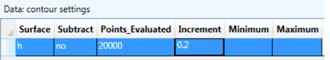
This is just the same plot, but enlarged. You can easily make a more accurate plot of this close-up window. First, change the plot window to this view by right-clicking over the plot and then selecting Set Plot Window to Current View. Also, under Plot Input / Contour Settings, change the Increment to 0.2 instead of 0.5:
Now make a new plot by selecting Make Plot / All Selected Features selecting level 1 and pressing OK. The plot should look like this:

If you repeat this, but make the plot of level 2, you get something like this:

The results show different head patterns, with more pronounced connection the river in level 1 and deeper drawdown at the well in level 2 where it is screened. The anisotropy of the domains makes the drawdown ellipse-shaped, with the K1 axis orientated 30 degrees north of east. The plot of the 2nd level is limited to the 3D area - there is no 2nd level outside the interdomain boundary that defines the limits of the 3D area. There is some drawdown near the well in level 1 due to strong downward vertical leakage between levels.
Examining Head Differences Between Levels
You can examine the difference in head between the two levels in a couple of ways. One is with the cursor information at the left. If you make a plot of heads in level 1, then move the cursor around the 2D area, you will see fairly large head differences listed at the left when you are near the well:
![]()
The positive number means the head in level 1 is greater than the head in level 2 and there is downward flow. If you move the cursor near some parts of the river, you may see a negative head difference indicating upward flow:
![]()
You can also make a contour plot of the head difference between levels. Select Plot Input / Contour Settings, and for Surface, select dh, which makes the contour plot a plot of the difference in head between this level and the one below:

If you select Make Plot / All Selected Features and choose level 1, the resulting plot of head differences looks like this:
Over most of the 3D area, the difference in head is less than 0.2, but there are larger positive differences near the well, and larger negative differences near the northern part of the middle river reach. The heavier contour is the zero contour. At the interdomain boundary that is the limit of the 2-level area, heads are forced to be equal by the boundary conditions, which is met at control points along the boundary and hence the zero contour weaves close to the boundary.

Making a Plot with Pathlines
Now we will make a plot with pathlines emanating from the well. Select Plot Input / What to Plot and edit the table so it looks like this:

The blank under Window makes subsequent plots cover the entire model, and we will display pathlines, but not vectors or SVAS polygons.
Select Plot Input / Contour Settings and edit the settings to show head contours with an increment of 0.5:

Select Plot Input / Pathline Settings and check the settings are as follows (similar to what we had in the first tutorial):

Select Plot Input / Pathlines / Well and edit the row so it is like the following, which will start 15 pathlines 50% of the way down in level 2 just outside the well radius, and trace pathlines upstream.

Now, select Plot Input / Pathlines / Line and if there is a row of data there from the first tutorial, uncheck the Show column since we only want to see well pathlines.

Now make a plot of level 1, which will result in something like this:

If you move the cursor over the pathlines near the well, you will see that they are in level 2, and as you move the cursor upstream, the pathlines generally rise because of recharge imposed on top of the model; some pathlines that enter the well from the northeast rise into level 1 within the 3D area. The pathlines east of the well migrates steeply downward in a stagnant zone east of the well (time markers are closely spaced here).
Analyzing the Solution in Detail
Anaqsim offers many ways to check and analyze the solution in detail. In this section we will explore some of them that apply to this model.
Examining Head at the Discharge-Specified Well
There are a couple of ways to check the head at the well. First, you could select Analysis / Discharge-Specified Well Heads / Write Heads to Run Log, which would display this in the Log tab:
![]()
Another way is to move the cursor near the well in Plot tab, right-click and select Check Nearest Well Head and Discharge, which will display a window like this:

Checking River Reach Discharge
Selecting Analysis / River Line Discharges / Write Discharges to Run Log writes the total discharge of all river reaches to the Log tab like this:

All three river reaches have negative discharges, meaning they are extracting water from the aquifer. You can see how discharge is distributed along a particular segment of a river reach by moving the cursor near a segment, right-clicking, and selecting Check Nearest Line Boundary Conditions. The following is the resulting plot for the segment just west of the well:

This segment loses water at one end and gains water at the other end.
Making Profiles along a Line
A useful tool in Anaqsim allows you to create a variety of profiles along a line.
Profiles Showing Head, Domain Boundaries, and Pathlines
Start by digitizing a line along which you will make profiles, similar to the one shown in yellow below, which goes approximately through the well.

Then select Analysis / Graph Conditions Along a Line and paste the digitized coordinates into the Coordinates box and edit the rest of the form as follows:

When you press the Make Plot button, you will see a profile of heads like this:

The domain boundaries are shown in gray, and you can clearly see the 2 layer 3D region roughly where 1200 < x < 1700. The red dot time markers are placed at the locations of each time marker arrow shown in the plan-view plot. The pathlines in this plot do several interesting things:
- Some are pulled up abruptly where they pass under a discharging river line (e.g. the lowest pathline at about x = 850)
- Some dive steeply as they pass under the recharge basin ( several at about x=1050)
- One dives steeply east of the well in a stagnant zone (about x=1650)
- Some jump vertically as they cross the interdomain boundary from the single-level 'all' domain to the 2-level 3D region (e.g. at about x = 1200). The jump occurs because pathline elevations are determined based on water balance. For example, if 40% of the discharge is above the pathline on one side of the interdomain boundary, 40% of the discharge is above the pathline on the other side of the boundary. Because the base elevation changes and because the flow field is different in the two layers, pathlines jump appropriately at these boundaries.
- Some pathlines appear to terminate above or below the water table (Head, level 1). This is because pathlines are projected onto the line, and most of these terminations are considerably to the side of the profile line and the water table elevation differs from the water table elevation on the profile line.
If you want to change the axes (for example, make the x axis start at a different value), you can do that by selecting Change Axis in the menu at the top of the plot. Read in the User Guide about saving and copying chart data and images.
Profiles Showing Domain Discharges
If you select Analysis / Graph Conditions Along a Line and edit the dialog so you check Domain discharge tangent to line and make the plot you will get a graph like this:

This shows the domain discharge, which is specific discharge times saturated thickness, tangent to the line. The discharge increases generally from x=0 to the well, as added recharge and impact of the well increase the discharge going east along the line. In level 2 where the well is screened, there is an abrupt shift in tangent discharge from positive to negative as you cross through the well. There is a similar, but muted shift in level 1 above the well. The steps you see in the level 1 profile are the result of river discharges subtracting (about x=850) and adding (about x=1400) to the discharge. At about x=1200 and x=1700, the profile crosses the interdomain boundary at the edge of the 3D area. Here the sum of the tangent discharges in levels 1 and 2 in the 3D area roughly equal the total discharge n the matching single-level area (the normal component of discharge is matched at interdomain boundaries, components in other direction can differ)
Profiles Showing Extraction, Evaluation SVAS Accuracy
If you select Analysis / Graph Conditions Along a Line and edit the dialog so you check Extraction and make a plot, you will see something like this:

Extraction is the net distributed flow out of the domain due to vertical leakage and storage fluxes, in units of discharge/area [L/T]. In the single-layer are of domain 'all', the only distributed flux is recharge coming into the domain a a uniform rate of 0.0006; since this is into the domain, it is a negative extraction (-0.0006 in the interval 0<x<1200). In the multi-level 3D area, in addition to recharge in level1, there is vertical leakage, which is mostly downward out of level1 and into level 2 where the well is screened. The vertical leakage is much larger magnitude than the recharge, so there is a large positive extraction in level1. There is the opposite in level2, as the leakage from level 1 creates a significant distributed source.
That the modeled extraction closely matches the extraction from heads indicates that the SVAS are working well. At this point, save your model, which is the final model for the second tutorial.
To see how basis point spacing can affect the accuracy of SVAS, we will tweak the model to make it have inadequate basis point spacing. Select Model Input / Area Source/Sink / Spatially-Variable, Well Basis Points, select he one row there and then delete it:

Then delete the SVAS polygon:

Now the model has sparse basis points in the 3D area, based on the domain SVAS settings.
Select Solve to solve this new, less accurate model. Then select Analysis / Graph Conditions Along a Line and make an extraction plot, which will look like this:

You can see with this profile that the comparison between modelled and heads-based extraction is poor in the 3D area. Use this tool to check if your basis point spacing is fine enough to give a good solution. See the user Guide for more details about extraction and SVAS. Don't save the model at this point, as it was only to point out how the extraction check can be used to evaluate SVAS accuracy.
Further Exploration for Anaqsim Deep Designer Users
This tutorial has been kept relatively simple so it could be done with the Demo and Quick Designer License. For Deep Designer licensed users, it is possible to expand and explore a bit more complexity. Here are some suggestions for modifying this model and adding some complexity:
Make the 3D area 4 levels
To do this, you will need to follow these steps:
- Edit the Domains table so you have two new domains that splice in between the top and bottom domains. Add two new domains (e.g. '3D 2' and '3D 3') and adjust the elevations and levels of these and the other domains in the 3D area. Don't change the names of the exiting domains because that will affect other elements that refer to domain names.
- Edit the '3D limits' interdomain line boundary so it refers to the new suite of domains on the multi-level side of this boundary.
- Edit the well and place it in the domain you want it in, also edit the well pathlines so they start at the desired level.
- Solve the system, make plots and examine the solution.
Add Head-Specified and/or Discharge-Specified Multi-Domain Wells
Anaqsim allows two other types of wells that you could experiment with. Read about and add head-specified and/or discharge specified multi-domain wells. The multi-domain well would have to be in the 3D area of the model, and could span 2 or more levels there. For multi-domain wells, the same head at the well radius is maintained in all domains spanned and the total discharge of the well elements in the spanned domains equals the specified discharge. Explore the tools in the Analysis menu for examining the discharges and heads at these types of wells.
Wrap up and Next Steps
This concludes the second tutorial. If you want to see the input file that was generated by this tutorial, then it can be found here: tutor2.anaq.
To explore transient and multi-level modelling with Anaqsim, please see the third tutorial, which edits this model to create transient simulations where the well discharge and recharge rates change with time.